

Self-Serve Services Marketplace for Banks & Fintechs.
I led all facets of design including user flows, explorations, branding, interactions, visuals, and prototyping. Conducted stakeholder interviews, competitor analysis and online study to understand the existing process & product space.

BACKGROUND
Zeta provides comprehensive and flexible services for banks and fintechs
A single, modern, cloud-native software stack with customizable mobile and web apps, fraud engine and rewards for retail banking. With a valuation of $1 billion, zeta had clients such as HDFC, ICICI, RBL, & many other national financial institutes.

PROBLEM SPACE
No place to host or sell the 20+ services of Zeta catering to different segments of banks and fintechs. Sales team was reaching out to potential customers and selling through 1:1 interaction which was slowing down growth.
Olympus: Online marketplace for Zeta’s services
The company was preparing themselves for differentiated market segments and customers globally . Business realized they need a more sophisticated approach to selling where they can provide an experience for customers to make an educated choice to subscribe and customize the product.

3D Illustrations by Rahul Menon
VISION OF OLYMPUS

1 place to host them all
Host all services from zeta suite in one place with exhaustive documentation and provide a seamless subscription experience for customers.

Quick Onboarding
Reducing time to onboard a customer to product suite and ease initial customer engagement journey for zeta

Grow the community
A shared platform for 3rd party services to serve our customers ensuring platform stickiness and ecosystem growth
TIMELINE
5 months for version 1.0
After multiple calls with the product and engineering team, we came up with a realistic timeline that will allow us to design, build & test. For version 1.0, the team decided to integrate only one service from zeta’s portfolio - namely Fusion into Olympus. But we had to keep in mind the scaling that will happen in the future.

Project timeline
RESEARCH & GOALS
8 Stakeholder interviews across 4 teams
Before diving into the project, I wanted to understand how the business and sales team were selling zeta’s services. I realized the process of buying the interest of the customer to onboarding them to one of zeta’s services involved 4-6 teams depending on the services.

Current customer journey
1-to-1 interviews were conducted with multiple people from Leadership team, Sales team, Business operations and Product & respective Dev teams to identify the existing steps & process to onboard a customer and listen to pain points and suggestions related to that journey
There was more than one problem to solve
I got into the project to understand how services were sold & customers were being onboarded. Through the interviews I realized there were 3 different opportunity areas .
Stakeholder Alignment
No single source of truth across stakeholders
From talking to different teams, I understood that there was lack of standardization & misalignment in terminologies used among different teams
Product design
Simplify a complex & time consuming process
By understanding the process, the product team and myself came up with a series of features and goals for version 1.0 keeping in mind the complexity of the product.
Branding
Zeta’s first consumer-facing product
Through discussions with leadership, we realized this was going to be a standalone consumer product, which will anchor the future of zeta. We had to create a strong branding identity.
FINDINGS ARE COUPLED WITH ACTIONS
For easier understanding, the findings from the interviews I conducted are coupled with the solutions in the following sections.
STAKEHOLDER ALIGNMENT
No single source of truth across teams
Talking to multiple teams helped me understand the complexity in which each team was operating. There was no transparency or alignment among them. Below are my findings:
FINDINGS
No single repository of knowledge
Each team was managing its own understanding documents in silo.
Misalignment on terminology
Creates a gap in understanding among stakeholders across teams. This creates difficulty in collaboration
Lack of standardization in tooling
Different tools to track the progress of the same team by different teams.
Conducted an alignment workshop
Before we could get into the meat of the product, I found it necessary to find alignment within these different teams. I conducted an alignment workshop with members from each team. We created a living document of Olympus with terminologies, concepts & rationale behind it. This helped create a shared knowledge repository.
Design Document
Created a product understanding document for share outs
I consolidated all my learnings into a product understanding document which was presented to all my design peers . It was further shared as a template for others. This share out helped unearth questions i didn’t think of , which in turned shaped our product.
Product Understanding Document
FINDING ALIGNMENT HELPED GATHER TRUST AND CONFIDENCE
Through the process of aligning the stakeholders, I was able to understand the product space better. It helped me move to next step with more confidence and build rapport with the different teams involved.
PRODUCT DESIGN
Simplify a complex & time-consuming process
Talking to different stakeholders helped me understand the existing behavior of our customers & the complex process to onboard a client into our platform.
FINDINGS
Sensitivity of information
Sensitivity of information within a bank/fintech demands different level of access for employees
Onboarding takes weeks
Onboarding process roughly takes 3-8weeks due to government and legal formalities
Customization
Customers want to customize the services according to their need to fit their existing system
Handholding
Customers require frequent handholding & repeated demos to understand the services.
Competitor analysis to understand existing mental models
Did a quick competitor analysis to understand the landscape of this product space. I documented products like IBM Cloud, AWS, Google cloud platform, Azure, Heroku . We understood how they were tackling handholding & registrations, which gave us a head start.

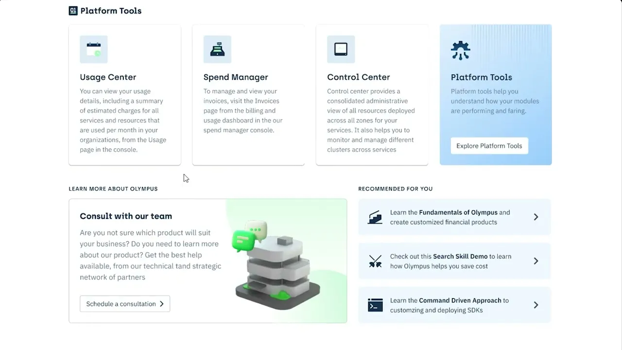
Detailing out the user flow from marketing to subscribing a product
I decided to use google docs to lay out the flows in collaboration with other stakeholders as the knowledge & requirement was shared across teams. People raised questions on configurations, flows and backend. This exercise helped us scope it down further.


Design Goals
Based on our findings from interviews & competitor analysis, along with the product manager, I came up with a set of design goals to direct us during design explorations.
Compelling Webpage
Quick Registration
Multiuser Access Control
Informative Product Page
Accessible Homepage
Seamless Subscribe Flow
Exhaustive Handholding
Initial Explorations
I went through multiple variations and explorations for each goal. High fidelity mockups helped different stakeholders visualize where the product was heading, and I received feedback on hierarchy of information, accessibility and visuals. Below are a few handpicked explorations from each flow.


NEED FOR BRANDING TO GUIDE VISUAL LANGUAGE
Before I could move on to building out our features, I had to finalize the branding for the product which will help me define the visual language & branding assets .
BRANDING IDENTITY
Zeta’s first consumer-facing banking product
The business wanted to create a strong online presence and memorable brand built around Olympus, as this was going to be the driver of zeta’s services in the future. To understand the vision of the leadership & thoughts from other stakeholders, my design manager and I conducted a branding workshop through Figma.

Branding Workshop
From the workshop I understood that the leadership team and design team inclined towards a simple, smart & associable logo - that conveys the first layer without any confusion. We were interested in using metaphors that indicate technology & engineering.
Explorations
With the help of 3 other designers & my design manager, we collaborated during exploration phase to diverge on options. We put them out to vote among designers & developers to understand where the mass incline towards.

Explorations from team
Down selected concept: A platform which helps you go from 0 to 1
There was unanimous choice on one of the options where, we had a line connecting “O” and “L” which meant it will help your company go from 0 to 1 . We smartly chose a font where “L” resembled “1” . Zeta was an engineering first company, the binary number 01, resonated with the teams.

Further Explorations by me on the down selected logo
COLOR PALETTE
The Green gives a sense of freshness and calmness . Something which is required when deploying clusters, managing critical deployments, etc. Along with it, the Yellow, adds the required tinge of optimism, creativity and energy.

Olympus: Branding Identity
Below is the final brand presentation for Olympus, I created. It was well received by the stakeholders and leadership team.

FINAL OUTPUT
Compelling Webpage
Created a simple & easy to sift through webpage for users to quickly get on to create account section. Directed the 3d illustrators in our team to create assets that go with our branding visual language.

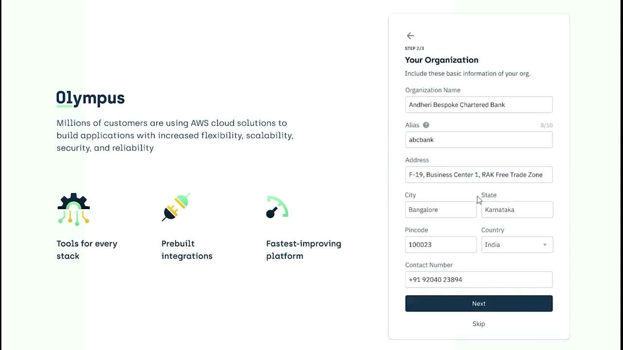
Quick Registration
We removed all verification processes for customers to get on to our platform. We stripped it down to most important information for customers to login and the rest was made optional.
27 sec video taking you through the registration flow
Accessible Homepage
Though we were onboarding only one service onto the platform for v1, we wanted to keep in mind the scalability factor and design the homepage. I included a section of tutorials & easy to access support on the homepage given the complexity of the platform.
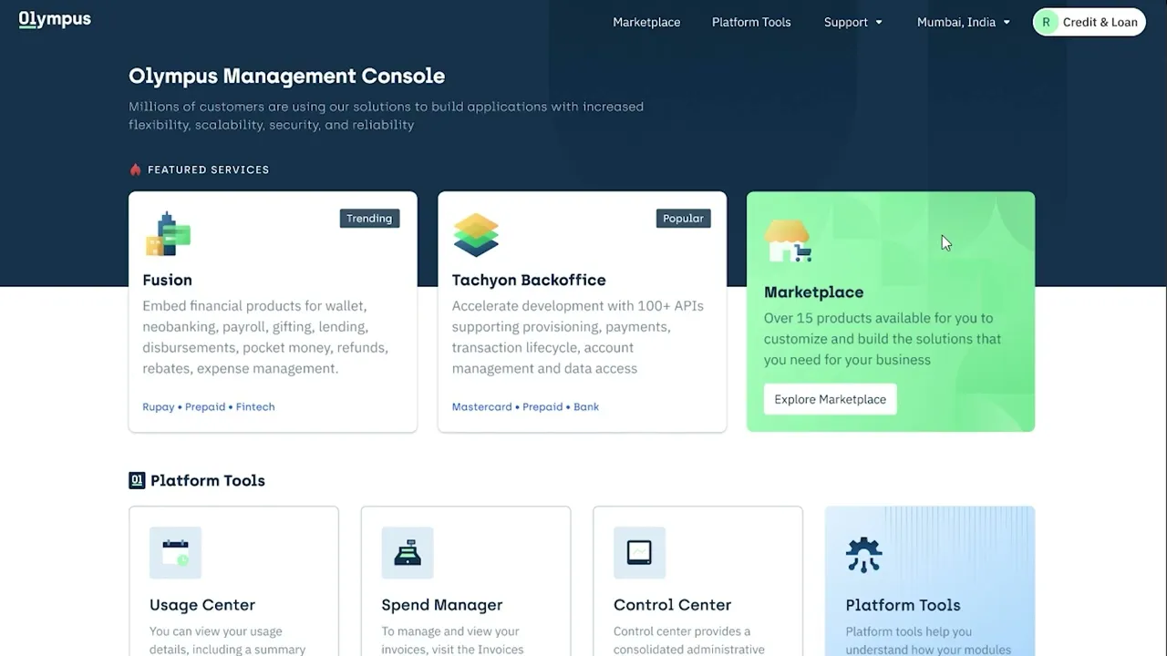
30 sec video taking you through homepage
Multi-User Access Control
Having learnt about the different levels of access, the employees of the bank would need. We came up with a concept of teams/accounts & users within that team . Each team will have varying levels of access like “viewer”, “editor” & “admin” which can be configured by the root user (executive who handles the company’s financial decisions).
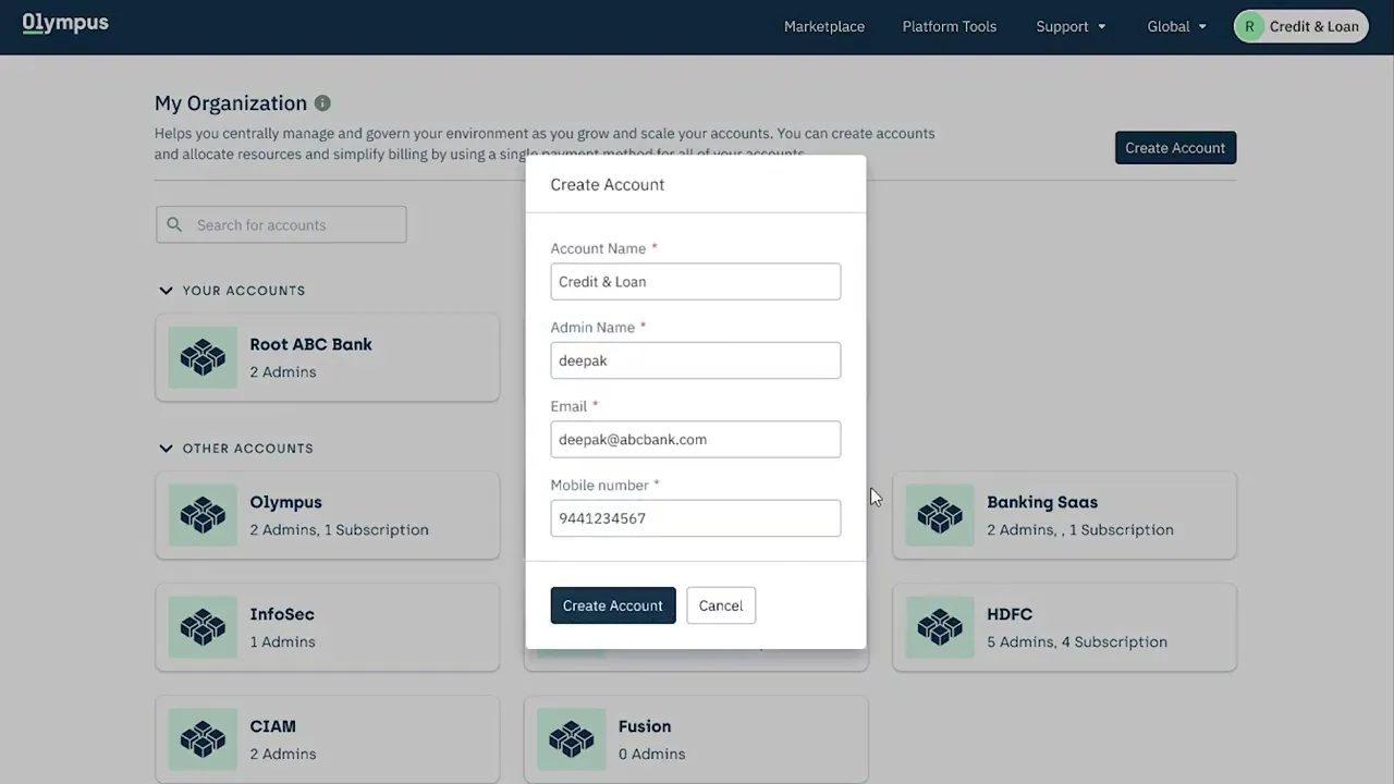
28 sec video taking you through teams & accounts
Informative Product Page
I had to come with a plug and play templates with different components that will allow each team to model the product page according to their requirement. This took quite a few variations before we figured out the necessary sections that satisfies all teams.
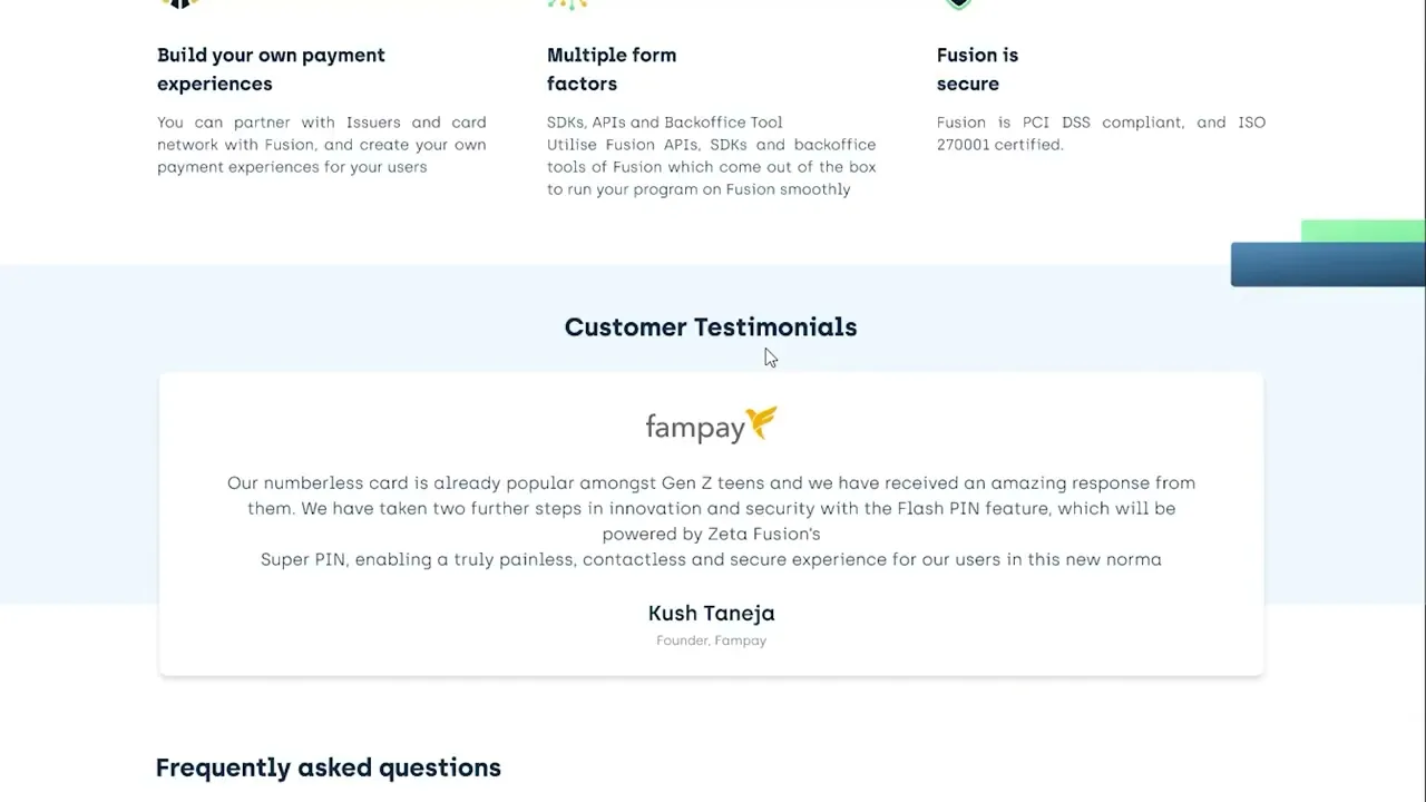
28 sec video taking you through one template of product page
Seamless Subscription Flow
Subscriptions can be time taking & customers don’t need all the services that were packed within the product. Backend modelling did not allow us to typically host services individually & the business also wanted to push services as a package. Having these in mind, I came up with a format that will allow customers to subscribe specific services within a product. I added options to allow customers to save progress. Also included soft nudges in homepage when customers take time to complete the subscription.
2 min detailed video on subscription flow and states
Exhaustive Handholding
This was the most important piece of the project. I came up with different levels of handholding . I wanted to keep the user informed at every step of the way. I made sure there was contextual information that will help the user progress.
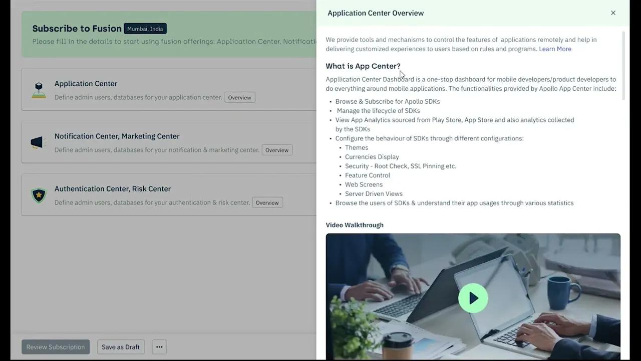
38 sec video on different handholding across the platforms
IMPACT
Practice of documenting design rationale was adopted by other designers
The product was dependent on multiple teams & stakeholders, it wasn’t always possible to discuss with everyone before a decision was made. I decided to document every design rationale right next to relevant screen. This became easier to track, and other stakeholders started commenting their inputs on these stickies .

Contextual help component was adopted into the design system
The contextual help component which I started experimenting with in Olympus, was well received & it was included as a part of the design system which was governing 15 other products withing zeta. Soon other products started adopting that feature.

Branding was well received and expanded to future products under Olympus
The team & leadership were happy with the branding, decided to extend it to other products that were cropping up within the Olympus Platform. Most the product names are working titles.
